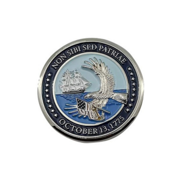
5 Air Force Challenge Coin Designs & Examples
Renita WingfieldKey Takeaways
- Air Force challenge coin designs get stronger when one clear unit story controls every symbol, word, and finish choice.
- Custom Air Force coins feel distinct when unit identity comes first and decorative detail stays in a supporting role.
- Production constraints should shape air force coin design ideas early so the finished piece stays legible, durable, and meaningful.
- Air Force challenge coin designs work best when every detail serves one unit story.
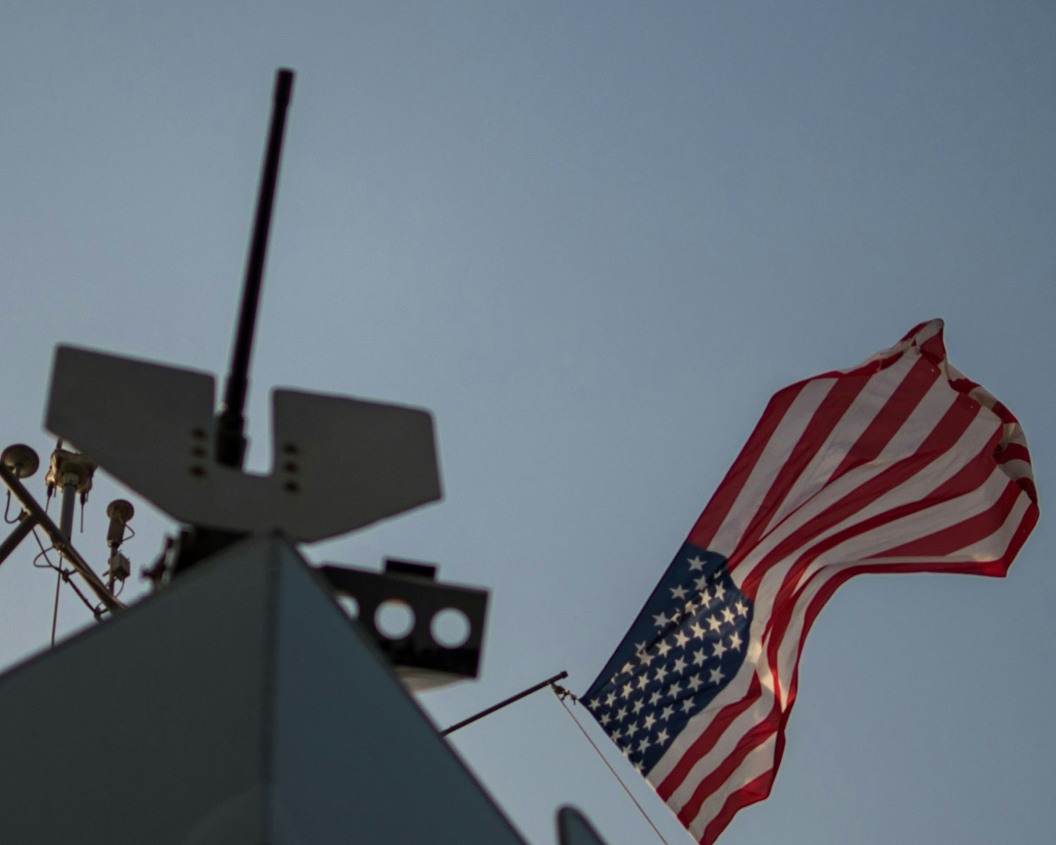
That standard matters because the Air Force is large enough that vague symbols blur into each other. The 2023 Department of Defense demographics profile counted 323,300 active-duty Air Force members, spread across units with very different missions. A coin has to signal squadron identity, duty focus, and rank of occasion in a glance. You will get a stronger result when you choose fewer elements and ask each one to carry clear meaning.
Air Force coin designs work best with one clear story

The strongest coin starts with a single message you can say in one sentence. A piece that tries to honor mission, history, mascot, deployment, and anniversary at once loses force. You should decide what the coin must say first. Every later choice will get easier and cleaner.
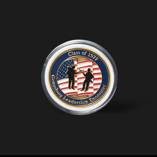
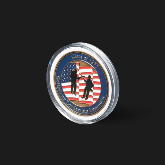
A squadron anniversary coin shows how this works. One side can carry the unit emblem and service dates, while the reverse shows the aircraft silhouette tied to that period. That pairing tells one story about service over time. Add a base map, a memorial ribbon, and three mottos, and the meaning starts to scatter.
Coins are small metal objects, and people read them in hand for a few seconds under uneven light. A clear story protects the design from late-stage clutter. It also gives you a standard for review when leaders, organizers, and peers all want something included. If an added element does not strengthen the main story, it should stay off the coin.
"A clear story protects the design from late-stage clutter."
Unit identity should guide every major design choice
Unit identity should lead size, icon choice, and wording because the coin has to stay recognizable outside your immediate group. A maintainer, aircrew member, and defender will each expect different visual cues. Your first job is to name the unit correctly. Your second job is to reflect what that unit actually does.
A rescue squadron coin should not lean on a generic fighter outline if rotary-wing recovery defines the mission. A civil engineer squadron piece will feel more honest with structural, readiness, or emergency support imagery than with a random aircraft silhouette. Shared Air Force symbols still need narrowing through a patch mark, a local motto, or a duty-specific image. That is what keeps custom Air Force coins from looking interchangeable.
Heraldry matters here, but so does restraint. Unit emblems, approved colors, and established mottos give you a strong starting point, yet they still need editing for coin size. You are not reproducing a full document seal. You are building a hand-held symbol that should identify a unit quickly and still feel accurate years later.
Symbol selection matters more than decorative detail
The main emblem will do more work than ornate borders or layered filler. Human subjects can identify images seen for as little as 13 milliseconds, which explains why the central symbol carries the first impression. You should protect that focal mark. Small decorative touches should support it instead of competing with it.
A coin built around a clean wing, tower, aircraft tail flash, or mission tool will read faster than one crowded with stars, gradients, and background texture. The same rule applies to rank recognition coins. A single command insignia placed high and centered will carry more authority than a busy field stuffed with minor patriotic motifs. Air Force coin design ideas usually improve when the main mark gets more room, not less.
Decoration still has value, but it should act like framing. Fine line texture can add depth. A small ring of stars can complete a border. Raised detail can give metal a stronger feel. Once those extras start pulling your eye away from the primary symbol, they stop helping the design and start weakening recognition.
Shape edge finish set the coin's visual weight
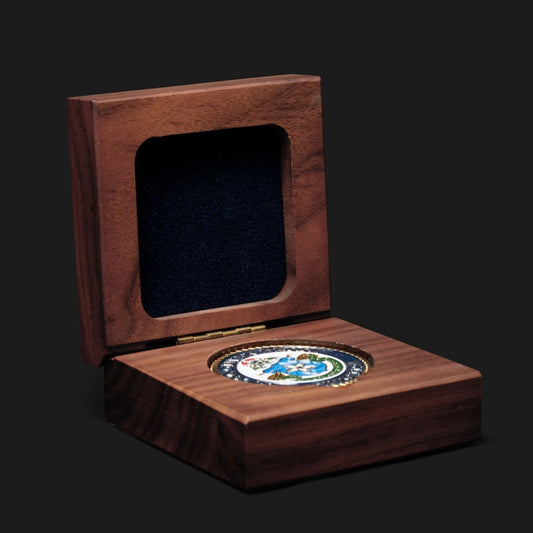
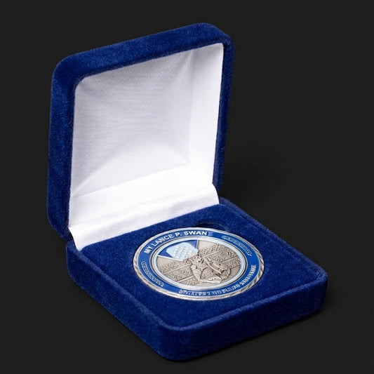
Shape, edge, and finish set the coin’s physical tone before anyone reads the design. Round coins feel formal and traditional. Shield or aircraft-inspired outlines feel more unit-specific. Rope edges, cutouts, and antique finishes add weight, while bright polish gives a cleaner ceremonial look. Those choices should match the purpose of the coin.
A retirement coin often looks stronger in antique brass or antique nickel because the finish adds depth to crests, wings, and service dates. A graduation or commander’s call coin can work well in bright nickel when you want crisp contrast and a cleaner presentation. Shape matters just as much. A simple round form keeps attention on heraldry, while a shaped outline asks the silhouette to carry part of the message.
Mockups matter here because metal does not behave like flat screen art. Teams working with Command Challenge Coins will usually review how relief depth, edge treatment, and finish interact before final approval. That step prevents thin lines from fading into a dark finish or a polished surface from exposing clutter that looked harmless on screen.
|
Design choice |
What the finished coin tends to communicate |
|---|---|
|
Round shape with antique brass |
This combination reads as formal and tradition-focused, which suits anniversaries, retirements, and command recognition. |
|
Shield shape with dark recessed areas |
This approach feels tied to heraldry and mission identity, so it works well for unit-first pieces with strong emblems. |
|
Bright nickel with smooth edge |
This finish looks crisp and ceremonial, but it will expose weak spacing and crowded artwork very quickly. |
|
Rope edge around a standard round coin |
This edge adds a classic military feel and extra depth, though it also reduces the space left for text. |
|
Simple cutout or shaped outline |
This style feels memorable in hand, yet it only works when the outer silhouette stays bold and easy to recognize. |
Text placement should protect legibility at small size

Text placement protects meaning only when the words stay short, large enough, and tied to the most important surface. Dates, unit names, and mottos need a clear reading order. Outer rings work for stable facts. Center fields work for one short phrase or no phrase at all.
A common layout puts the official unit name on the front rim and the event or recognition line on the reverse. That structure works because readers know where to look first. Trouble starts when designers push a long slogan into a lower arc, add rank abbreviations on both sides, and squeeze location text into the center. The coin ends up technically complete but visually hard to read.
Good text design also respects metal limitations. Thin serif lettering can fill in. Tiny letters lose clean edges after plating and paint. A shorter motto in larger raised type will outlast a full sentence tucked into a narrow ring. If the wording matters enough to include, it matters enough to make readable.
"If the wording matters enough to include, it matters enough to make readable."
Five Air Force coin examples show distinct design paths
Strong examples show that custom Air Force coins succeed when each design path matches a specific use. The best pieces do not chase novelty for its own sake. They solve a clear recognition need. That is why useful examples look different from one another while still staying simple.
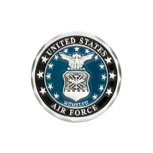
- A squadron heritage coin pairs the unit crest with service dates and keeps the reverse focused on lineage.
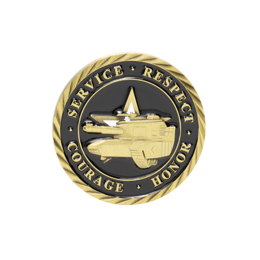
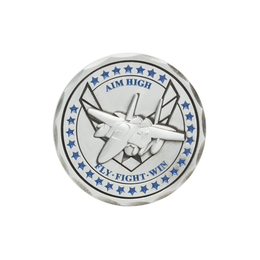
- An aircraft mission coin uses a single silhouette and tail marking so the airframe is identifiable at a glance.
- A deployment coin marks place and timeframe with one map cue and one mission symbol, rather than a full scene.
- A rescue or support coin centers the mission tool, such as a hoist, tower, or wrench, before any decorative border.
- A retirement or command coin gives more space to rank, years of service, and a formal finish that fits presentation use.
Each path answers a different need, and that is the point. A unit heritage coin should feel different from a deployment coin because the purpose is different. Air Force challenge coin design ideas improve when you sort the occasion first, then match imagery, finish, and wording to that occasion. That simple order keeps the coin honest.
Common design mistakes weaken meaning before production begins
Most weak coins fail before production because the design tries to solve too many problems at once. Cluttered fronts, tiny text, mixed symbols, and copied clip-art all reduce meaning. You should treat every added element as a cost. If it does not sharpen identity, it will blur it.
One common mistake is mixing unrelated imagery just to fill space. A coin for a maintenance unit can lose its voice when a random eagle, a generic jet, a state outline, and six stars all compete for attention. Another mistake comes from copying a shoulder patch exactly and shrinking it without simplification. Patch art and coin art follow different physical rules.
Approval culture can create the final problem. Too many reviewers will ask for one more name, one more slogan, or one more symbol. That pressure feels respectful, yet it usually produces a weaker result for everyone named on the piece. The better move is to defend the main message and let the metal breathe.
Production limits should shape the final design brief
Production limits should shape the brief because metal, enamel, and relief depth will decide what survives the jump from sketch to coin. Thin lines will soften. Tiny spaces will close. Extra colors will crowd the surface. A good brief names the features that must stay clear after that simplification happens.
A shaped coin with a cutout aircraft tail, two enamel colors, raised text, and an antique finish can look sharp if the brief calls out minimum line thickness and keeps the silhouette clean. The same concept will fall apart when the drawing adds miniature serial numbers, shaded clouds, and a second border ring. Good production planning is really design discipline under a different name.
The Air Force coin designs that hold value over time are the ones built with restraint and proofed with care. That is why units often return to Command Challenge Coins when a piece has to respect heraldry, read cleanly at hand size, and still feel personal to the people who receive it. The strongest coin is the one that still makes sense years later, after the ceremony is over and the story has to stand on its own.