9 Local Symbols That Elevate Your America 250th Anniversary Coin Design for State And City Pride
Renita WingfieldKey Takeaways
-
Local identity makes an America 250th coin feel personal by highlighting state, city, and community stories that recipients recognize instantly.
-
A focused mix of state flags, skylines, wildlife, and monuments turns a regional heritage coin into a clear, meaningful symbol of service and connection.
-
Structuring each side around one primary icon with a few supporting accents protects legibility, improves photography, and keeps production quality high.
-
Purposeful choices around relief, finishes, and limited color use help state icons coin 250th designs stay readable at a distance and in daily handling.
- Thoughtful planning that blends local symbols coin 250th concepts with city landmarks coin and mottos strengthens relationships, gifting moments, and long term pride.
Local identity makes a 250th anniversary coin feel personal from the first glance. You want recipients to see their own story reflected in the metal, not just a generic anniversary mark. The right visuals connect service, hometown pride, and shared history in one compact format. Thoughtful choices strengthen recognition and create a keepsake people will keep and talk about.
America’s 250th is a rare moment to honor heritage at the state, city, and community level. You can turn that moment into something tangible that builds connection across teams, clients, and stakeholders. Specific icons guide the eye, anchor memory, and express gratitude with clarity. Strong concept work today will deliver a coin that carries meaning for decades.
How Local Identity Shapes Meaningful America 250th Coin Art
Local identity gives your coin an emotional anchor that standard national motifs cannot match. People feel seen when they notice a state flower, a familiar skyline, or a trusted civic emblem. Those details say more than dates or slogans because they signal belonging and shared commitment. Thoughtful alignment of imagery, typography, and finishes turns a good concept into a lasting symbol.
Teams planning America 250th coins also carry practical goals. You want to strengthen relationships, simplify gifting, and elevate brand prestige with a piece that feels tailored, not off-the-shelf. Local symbols accomplish that by sparking instant recognition and conversation at ceremonies and meetings. Recipients proudly display coins that mirror their community identity.
Design decisions should follow a clear story arc that ties icons to purpose. A city bridge can represent connection, a seal can signal authority, and a flower can highlight roots across generations. When those cues support your message, the coin reads clearly at arm’s length and up close. That clarity will improve photography, catalog placement, and presentation moments.
9 Local Symbols That Strengthen Your America 250th Coin Design
Strong local cues will help your America 250th piece stand apart and feel authentic. Your audience should recognize the imagery at a glance, then discover fine details as they handle the coin. Each choice should connect to a narrative that honors service, partnership, or place. Consistency across front and back will keep the message focused and memorable.
1) State Flags That Showcase Shared History And Local Pride

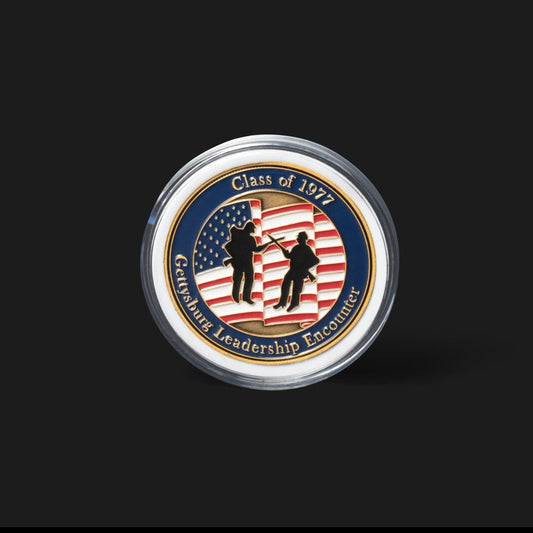
State flags provide a direct signal of place that works well across sizes. A partial treatment, such as a canton or a star field, can add color without overwhelming other elements. You can emboss fabric folds for texture, then use soft enamel or colorfill to keep edges crisp. The result communicates heritage and helps you place other icons with purpose.
Flags also support the target keyword strategy for local symbols coin 250th projects. When paired with a date ribbon and a unit or agency mark, the layout reads clearly in photos. Color order and contrast matter, so plan finish choices that maintain visibility under varied lighting. A raised rim can frame the flag and protect color during frequent handling.
2) Iconic City Skylines That Define Community Identity And Recognition
![]()
A skyline silhouette delivers instant “home base” recognition. Simple outlines of two to four distinctive buildings will keep lines clean at minting scale. You can recess the skyline to create depth, then polish the foreground emblem for contrast. That layering makes the coin easy to scan while adding visual richness.
City skylines also support the keyword city landmarks coin for America 250th storytelling. Consider a night-sky field with microtext stars that include the anniversary year. Negative space between towers can shape the eye path toward your centerpiece seal or motto. Keep spacing generous so small architectural details remain readable after plating.
3) Regional Wildlife That Highlights Natural Heritage And Local Character
Wildlife connects people to land and tradition without needing text. A single, well-sculpted animal or bird can communicate strength, guardianship, or resilience. Textured feathering or fur adds tactile interest that encourages recipients to turn the coin in hand. Those touches invite conversation at award ceremonies and client meetings.
Wildlife also aligns with regional heritage coin themes that honor conservation and stewardship. Pair the animal with a subtle terrain cue like waves, plains, or foothills to complete the story. Keep anatomy accurate, then simplify edges so relief lines strike cleanly. Small accents such as footprints or tracks can live on the reverse to surprise the viewer.
4) State Flowers And Plants That Add Distinct Cultural Roots
Botanical elements introduce grace and specificity while balancing bolder marks. Petals, leaves, and stems create natural frames around seals, dates, and mottos. You can sculpt a wreath that cradles the central emblem and guides the viewer’s gaze. Repetition of three to five petals will create harmony without clutter.
State flora also strengthens search visibility for state icons coin 250th planning. Choose finishes that preserve petal highlights, then add sandblasted recesses to keep shadows clean. If color is essential, apply selective enamel rather than coating the full stem to protect line art. A thin border around the floral motif will prevent chipping during daily pocket carry.
5) Historic Buildings That Represent Longstanding Community Significance
A courthouse, capitol, or heritage hall can signal longevity and trust. Detailed steps, columns, and cornices look impressive when modeled as high relief. Depth variation across windows and doors will keep the form legible under direct light. That readability matters during photography for awards programs and internal communications.
Historic architecture supports partnerships across government, first responder, and corporate audiences. The building can sit behind your primary badge, allowing the badge to take center focus. Consider an antique finish that settles into architectural recesses and highlights edges. This approach keeps the structure recognizable while maintaining clarity for nameplates and dates.
6) Local Bridges That Reflect Connection And Regional Milestones
Bridges communicate unity, progress, and access. Cable lines, arches, or trusses convert well to clean metal geometry that mints reliably. A slight arc across the field can create movement without covering key emblems. You can echo that arc with a ribbon on the reverse that lists campaign themes or values.
Connection themes also support gifting goals for clients and stakeholders. Bridges can flank a central seal to suggest partnership across teams or agencies. Polished cables against a matte sky produce a readable silhouette at small scale. The result feels intentional, substantial, and easy to present at ceremonies.
7) State Seals That Convey Authority Tradition And Legacy
Official seals deliver legitimacy that recipients recognize immediately. The seal can anchor the front while local accents add personality around it. Clean vector preparation will preserve lettering and micro details during die creation. A protective rim around the seal will reduce wear from frequent handling.
State seals reinforce the keyword state icons coin 250th through clear governmental storytelling. Consider a split treatment with the seal on front and a community motto on reverse. A frosted field behind the seal will ensure text contrast without heavy color use. This balance projects respect for tradition while keeping the coin accessible to wider audiences.
8) Community Mottos That Capture Regional Purpose And Spirit
Short mottos give your coin a voice. You can set a four to six word phrase on a ribbon that frames the primary icon. Serif typefaces read well at small sizes and pair nicely with classic seals. Keep letter spacing slightly generous to protect legibility after plating.
Mottos also help you unify state and city cues into one message. A shared phrase can tie a skyline, a flower, and a flag into a single theme. Consider raised lettering with recessed enamel inside the ribbon for quick readability. The outcome is clear direction that supports ceremonies and gift exchanges.
9) Landmark Monuments That Honor Local Achievement And Heritage

A well-known statue or memorial marks place and values at once. Simplify the form to strong contours, then use shading lines to suggest depth. A discreet wreath or laurel beneath the monument can reference honor and service. Use consistent line weight so the figure remains recognizable at a glance.
Monuments provide search alignment for city landmarks coin storytelling, especially for America 250th themes. Place the monument slightly offset to create room for a date or unit name. If multiple monuments are relevant, select one primary and one secondary accent to avoid clutter. That discipline keeps the coin refined and easy to read in low light.
Strong local symbols will make your coin both beautiful and purposeful. A focused mix of two to three icons per side will protect clarity and mint quality. Strategic keyword placement, such as regional heritage coin and local symbols coin 250th, supports discoverability without forcing grammar. Consistency across relief, finish, and color will deliver a confident presentation that people remember.
“Local identity makes a 250th anniversary coin feel personal from the first glance.”
Practical Ways To Select Icons That Fit Your Coin Vision
Clear selection criteria will keep your concept on track and your schedule predictable. Start with purpose, audience, and presentation moments, then build a shortlist that fits those goals. Confirm that each icon supports recognition at arm’s length and detailed inspection up close. Finish choices should serve legibility first, then style.
-
Map each icon to a goal such as recognition, authority, or connection, then remove any that do not serve a goal.
-
Limit each side to one primary icon and one or two supporting accents to maintain clarity.
-
Test legibility at 3 feet on a printout to ensure lines, letters, and silhouettes read cleanly.
-
Choose finishes that create contrast between icons and fields, such as polished elements against frosted backgrounds.
-
Prioritize vector cleanliness and simplified shapes over intricate textures that could fill during plating.
-
Align color choices with flags or seals only where color is essential, then let relief do the heavy lifting.
A disciplined process will shorten approvals and reduce rework. Your production partner will translate clean decisions into crisp dies and consistent plating. The result is a coin that presents well in photos and feels substantial in hand. Clear proofing stages and confident selections keep the timeline steady.
“Strong local symbols will make your coin both beautiful and purposeful.”
How Command Challenge Coins Supports Your Custom 250th Coin Project
Command Challenge Coins translates local identity into precise, production-ready art that holds up at scale. Our team reviews your story, identifies the strongest state and city cues, and organizes the narrative into a clean front and back plan. You get guidance on relief depths, finish contrast, and color usage that protect legibility. We also provide proofs that reflect true minting constraints, so you can approve with confidence.
Operational details matter when you are coordinating gifts for clients, honorees, or community partners. We align packaging, inscriptions, and presentation timing to simplify distribution and reduce stress on event leaders. You will receive recommendations that connect your local icons to ceremony scripts and display needs. That planning turns a regional heritage coin concept into a polished experience that strengthens relationships and brand prestige.
Count on Command Challenge Coins for precision, respect, and proven reliability.
Common Questions
People often ask how to choose the right mix of local symbols without crowding the design. Strong answers start with purpose, audience, and presentation context. Clear criteria protect legibility while keeping meaning front and center. The guidance below focuses on practical steps you can act on immediately.
What local symbols work well on a 250th coin?
Choose icons that signal place in under two seconds, such as a state flag, a skyline cutout, or a single heritage monument. Each selection should support a purpose like recognition, authority, or unity. Keep one primary icon per side and let supporting accents frame, not compete with, the centerpiece. Relief contrast, clean edges, and modest color use will protect clarity for daily handling.
How to blend state and city icons on a coin?
Set a clear hierarchy where either the state or city carries the lead role. For example, position a state seal at center, then echo the city identity with a small skyline or motto on a ribbon. Maintain breathing room so the eye can read each element before moving on. Balanced scale and consistent finish choices create cohesion without visual noise.
How do I keep fine details readable at minting size?
Simplify edges, reinforce negative space, and avoid hairline gaps that could fill during plating. Test the art on a grayscale printout at actual size and at 75% size to stress legibility. Use frosted fields behind small text and polished tops on raised letters to improve contrast. Clean vectors and disciplined line weights will deliver crisp strikes across the batch.
What finish and color choices work best for local symbols?
Choose finishes that separate icons from background fields, such as polished emblems against a matte or sandblasted backdrop. Reserve color for essential elements like flags or small spot accents that guide the eye. Too many colors can reduce contrast and blur fine lines during wear. Relief and texture should carry most of the storytelling so the coin looks sharp in any light.
How can coins support gifting and relationship goals for America 250th?
Plan the design around the moment of presentation, the message you want remembered, and the audience who will keep the coin. A clear local symbol paired with a short motto will make the piece feel tailored and respectful. Include packaging that names the city or state to extend the story on the outside. Recipients value coins that reflect their community and honor their contribution with care.
Thoughtful structure will make your state icons coin 250th concept both meaningful and mint-ready. Local symbols connect the piece to people who live the story every day. Clear hierarchy, contrast, and spacing ensure the coin reads well for photos and ceremonies. Purposeful design choices today will deliver a piece that earns its permanent place on desk, shelf, or uniform pocket.
