What makes a premium challenge coin
Renita WingfieldKey Takeaways
- Judge premium challenge coins through repeatable signals you can verify, including crisp relief, clean enamel borders, and consistent finishing.
- Start quality control with the foundation since metal choice and thickness set the limits for depth, edge detail, and long-term wear.
- Insist on a proof and inspection process that tests color, legibility, and edge comfort before full production.
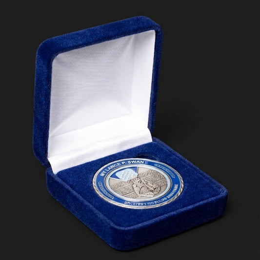
Premium challenge coins feel deliberate the moment you hold them.
A high quality challenge coin stays sharp under light, feels balanced in your hand, and holds up to handling without flaking or turning muddy at the edges. Even circulating coinage uses engineered metal choices, with a current U.S. quarter made from 91.67% copper and 8.33% nickel. Premium challenge coins take that same manufacturing seriousness and apply it to your design and purpose.
You can judge quality without being a mint specialist if you know where defects show up first. Start with the foundation material and thickness, then look at how the artwork is struck, how color is filled, and how plating protects or exposes surface prep. Last, confirm the process includes proofs and inspection steps that prevent small issues from becoming a large batch problem.
"That feeling comes from disciplined coin craftsmanship, not extra decoration."
|
Quality signal you can verify |
What that signal tells you |
|
Fine lines stay crisp under bright and low light |
Die work and strike pressure were controlled, not rushed. |
|
Raised areas have clean edges and even height |
Relief planning matched the coin thickness and artwork detail. |
|
Color fills look even with tight borders |
Enamel fill technique and curing were handled with care. |
|
Finish looks consistent across flat and textured areas |
Surface prep and plating steps were consistent across the run. |
|
Edge details feel smooth and intentional, not sharp |
Trimming, edge tooling, and final inspection were not skipped. |
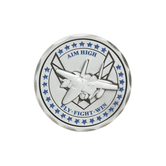
A premium challenge coin shows precision in every detail
A premium challenge coin is defined by control, not complexity. Each step has to reinforce legibility, durability, and a clean feel in hand. The artwork will read clearly at arm’s length and still reward close inspection. Premium quality shows up fastest in the tiny places that are easy to ignore.
Start your evaluation where defects tend to hide. Look at small text, thin outlines, and tight corners because those features reveal weak striking and sloppy enamel. Run a fingertip across raised areas and edges to check for burrs, rough trimming, or uneven height. Tilt the coin under light and watch how highlights move, since inconsistent surfaces will flash blotchy or dull.
Premium challenge coins also feel coherent, meaning every design choice supports the purpose of the coin. A coin meant for recognition should favor clarity and tactile impact over crowded visuals that blur when handled. More features will always raise the chance of tolerance issues, so the best coins stay disciplined about what they include. That discipline is what separates “busy” from “high quality.”
Metal choice and coin thickness set the foundation
Metal and thickness determine weight, stiffness, and how well details strike. A good base metal supports clean relief without warping, and it accepts plating evenly. Thickness also affects how premium a coin feels in the hand. If the foundation is weak, the best artwork and finish still won’t look right.
Thickness is not a vanity detail, because it sets the ceiling for relief depth and edge treatment. A U.S. nickel is 1.95 mm thick, and that comparison helps you understand why many premium challenge coins feel more substantial than pocket change. Heavier blanks also resist bending, which matters when coins are carried, traded, and handled often. If you want bold relief or edge text, a thin blank forces compromises that show up as shallow features and soft edges.
Material choice shapes long-term wear and how finishes age. Softer base metals can mark more easily, which makes surface prep and protective finishes more important. Harder alloys tend to hold crisp edges longer, but they can require more strike pressure and tighter process control. When you’re choosing, match the foundation to use, handling frequency, and how much fine detail the design truly needs.
Die striking and relief depth define crisp coin artwork
Die striking quality controls how sharp the artwork looks and feels. Strong dies and the right strike pressure create clean edges, readable text, and consistent relief height. Relief depth also shapes contrast, since shadows and highlights are what make a design “pop.” If the strike is weak, the coin will look flat even with a great concept.
Crisp artwork comes from thoughtful sculpting and disciplined file prep, not just a high-detail drawing. Thin lines that look great on a screen can merge on metal if spacing is too tight or the relief plan is shallow. Tiny text near the edge is another stress test, because trimming and plating have less margin for error there. Shops that do this well will push you toward artwork choices that survive the physics of metal, and teams working with Command Challenge Coins typically see those adjustments during the proof stage instead of after production.
Relief choices always involve tradeoffs. Higher relief increases tactile impact but can reduce the usable flat space needed for clean text and smooth plating. Multi-level relief can add depth, yet each level needs enough separation to stay readable after plating and handling. The best approach is simple and strict: prioritize the details that carry meaning, then protect them with spacing and relief that will strike clean every time.
"Premium challenge coins make complexity look effortless because the build quality is controlled."
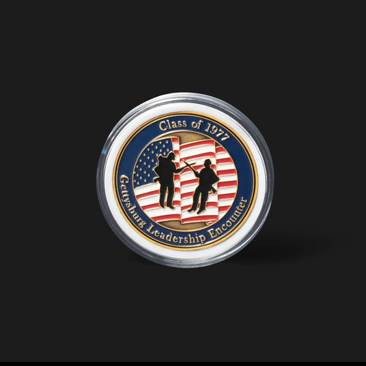
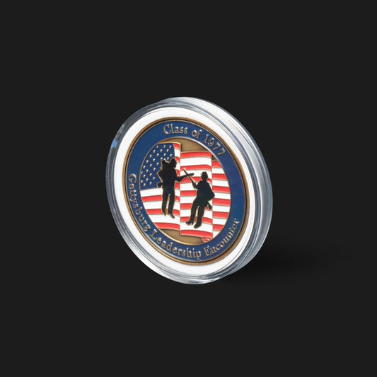
Enamel fills and color matching separate high-quality coins

Enamel work is where many coins either look premium or look cheap. High-quality challenge coins have clean fill boundaries, consistent color, and a surface that matches the chosen style. Soft enamel should sit evenly within recessed areas, and hard enamel should feel smooth after polishing. Color should look intentional under normal indoor lighting.
Fill quality starts with prep and ends with patience. Clean recessed walls help enamel stop exactly where it should, and careful filling prevents bubbles, pinholes, or uneven height. Hard enamel requires extra steps to cure and polish to a smooth plane, so flaws are easier to spot if the process is rushed. Glitter, translucent fills, and gradients can look excellent, but they add failure points that require tighter control.
Color matching matters most when the coin represents an organization with established colors. A clear color spec reduces rework and prevents “close enough” results that look off next to uniforms, patches, or brand materials. Ask for confirmation of the color system used, and expect slight shifts between digital screens and enamel on metal. Premium results come from choosing a standard, reviewing a proof carefully, and accepting only what matches that standard.
Plating and finishing control shine texture and wear
Plating and finishing determine how a coin reflects light, resists handling marks, and frames the artwork. A premium finish looks consistent across the full surface, including textured areas and tight corners. Good plating also protects the base metal and reduces visible oxidation over time. Poor prep will show through as pits, dull patches, and uneven tone.
Finish is not just about “gold” or “silver,” because the surface treatment under the plating changes everything you see. Polished areas highlight edges and detail, while matte or blasted areas reduce glare and can make text easier to read. Antique finishes can bring out relief by darkening recessed areas, but they also reduce contrast if the design relies on thin lines. Two-tone plating adds visual hierarchy, yet it requires precise masking so boundaries stay sharp.
- Ask if the finish is polished, matte, or antique
- Confirm how textured areas will be treated
- Check how two-tone boundaries will stay sharp
- Ask how the finish affects readability of small text
- Confirm coins are inspected for pits and plating skips
Think about wear patterns, not just the first unboxing. High-contact areas like raised edges and high points will show handling first, so consistent plating and clean prep are the difference between a coin that ages with character and one that degrades fast. If the coin will be carried daily, favor finishes that hide small marks and protect relief. If the coin will be displayed, higher shine can work well, as long as the surface is uniform and clean.
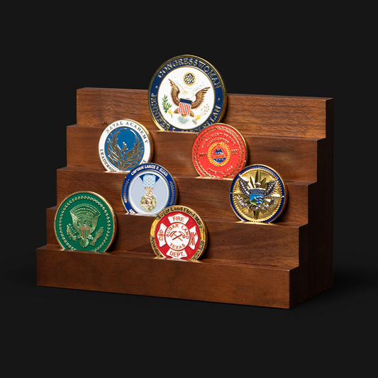
Edge details cutouts and attachments raise complexity and cost
Edge treatments and add-ons are quality multipliers because they increase tool steps and tolerance risk. Clean edge text, reeding, or rope edges should feel uniform all the way around. Cutouts need smooth interior walls without chatter marks. Attachments such as spinners must align and move cleanly without scraping.
Complexity needs a purpose, or it becomes an expensive distraction. Edge text can add meaning with mottos, dates, or unit identifiers, but it also demands clean spacing so letters don’t pinch or fill in. Cutouts can frame a symbol, yet thin bridges and sharp internal corners are weak points if the coin will be carried. Moving parts add another layer of fit and finish, so you should expect more proof scrutiny and more inspection time for a truly premium result.
Good craftsmanship shows in comfort and durability. Edges should never feel sharp, and attachments should not rattle loosely or bind. When a design calls for advanced features, insist on clear tolerances and a proofing approach that checks alignment, not just artwork. Premium challenge coins make complexity look effortless because the build quality is controlled.
Proofs samples and quality checks confirm premium results

Proofing and inspection turn premium intent into premium output. A clear proof process catches issues before they become hundreds of identical defects. Quality checks should verify color, finish consistency, edge comfort, and legibility of small details. If a vendor can’t describe those checks clearly, the coin quality will be inconsistent.
A concrete process matters most when details are tight or colors must match. A procurement lead ordering recognition coins for a fire department can approve an art proof that looks perfect on screen, then request a pre-production sample and notice the finish darkened the small edge text and the blue enamel reads too purple under station lighting. That early catch prevents a full run that misses the department’s color standard and forces awkward distribution. The premium path is slower at this step, but it avoids the only delay that matters, which is fixing mistakes after production.
Judgment comes down to this: premium challenge coins are made through repeatable controls you can verify, not promises you have to trust. Proofs should be reviewed with the same seriousness as any other branded artifact that represents your team, because the coin will outlast the moment it commemorates. Command Challenge Coins builds that discipline into the approval flow so the final pieces match the intended meaning and hold up in hand over time. When execution is tight, the coin becomes a lasting symbol instead of a short-lived giveaway.