12 Most meaningful military challenge coin design elements
Renita WingfieldKey Takeaways
- Set a one-breath purpose first so every design choice supports the same message.
- Prioritize unit identity, then mission, then a specific time marker to keep the coin readable and meaningful.
- Protect meaning through disciplined execution using correct official marks, clear hierarchy, and tight text control.
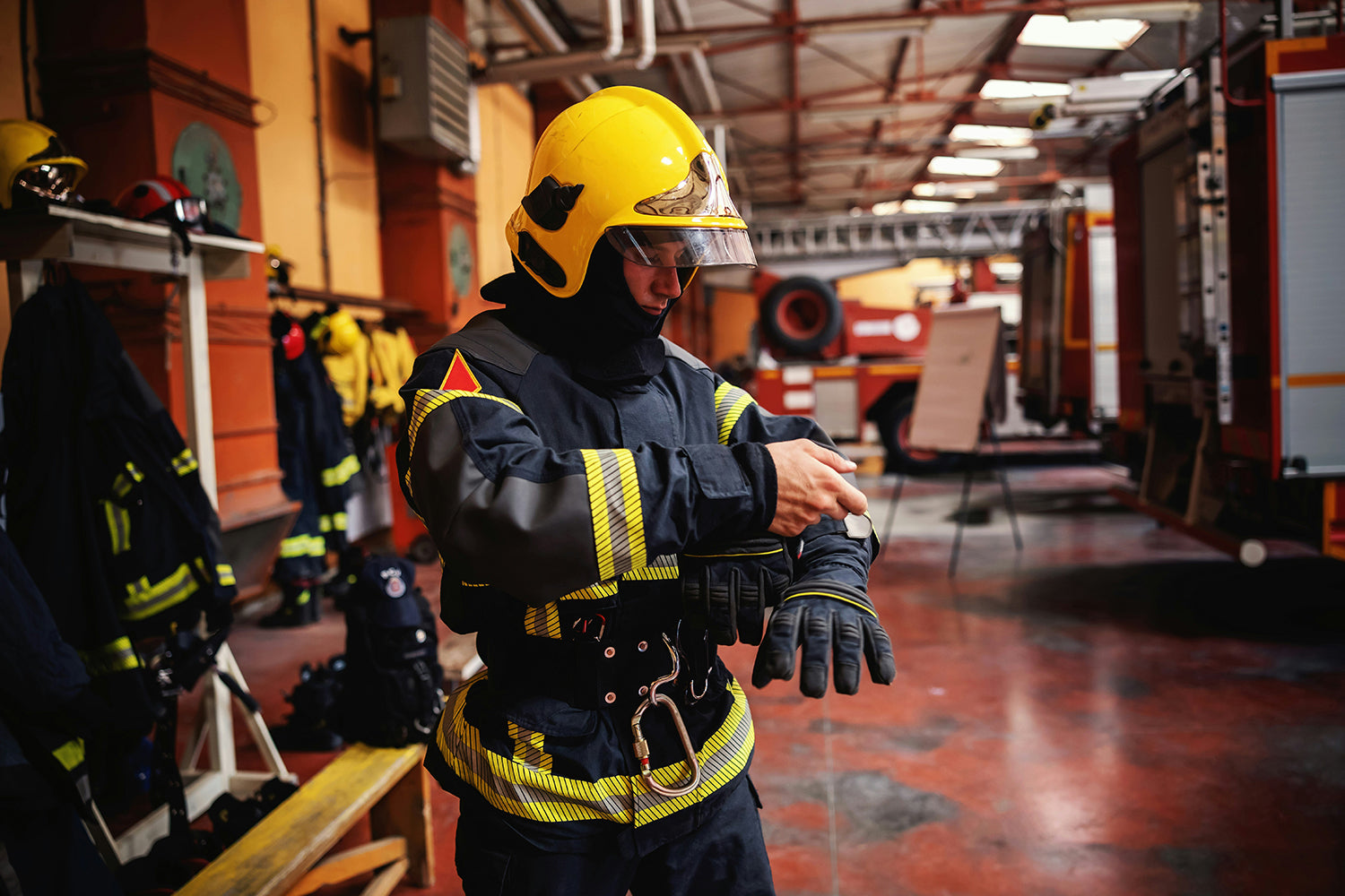
That clarity matters because a coin often gets only one quick look before it gets pocketed for years. About 1.3 million people serve on active duty in the U.S. military, so shared visual standards help small-unit identity stay recognizable even across large organizations. Meaning comes from disciplined choices, not from packing every symbol onto one side. Your job is to make the coin easy to understand and hard to forget.
Most meaningful military challenge coin designs follow a simple pattern. They lead with official identity, then show purpose, then mark a specific moment worth remembering. Extra details still matter, but they should support the main story instead of competing with it. When you treat design like a comms problem, the art becomes easier, approvals move faster, and the coin feels “right” the first time someone holds it.
"Pick coin elements that communicate your unit’s identity in seconds."
Set the mission for your coin before choosing art
A meaningful coin starts with a plain-English purpose statement you can defend in one breath. You decide who will receive it, what moment it marks, and what you want the coin to signal at a glance. That purpose sets the priority order for your unit coin elements. Without it, design reviews turn into taste debates and the message gets blurry.
A coin for a platoon returning from a nine-month deployment will prioritize shared identity and dates, while a coin for a commander’s presentation will prioritize official seals and clean hierarchy. That single choice will also guide size, finish, and how much text you can fit without hurting legibility. Teams at Command Challenge Coins typically ask for your intent first, then build proofs that keep the main story readable at arm’s length. You’ll get a better coin when the mission stays the filter for every detail.
12 military challenge coin design elements with lasting meaning

Strong coins repeat a few proven elements because those elements carry authority, memory, and unit pride. Each option below can add meaning, but only when it fits your purpose and stays readable. A clean coin with two or three high-signal elements will outperform a crowded coin with ten competing messages. Use this list as a menu, not a checklist.
Pick the elements that match your unit’s identity rules, your audience, and how the coin will be presented. Limit text, protect official marks, and keep contrast high for fast recognition. Small choices like spacing and hierarchy affect meaning as much as the symbols themselves. The best results come from selecting, not stacking.
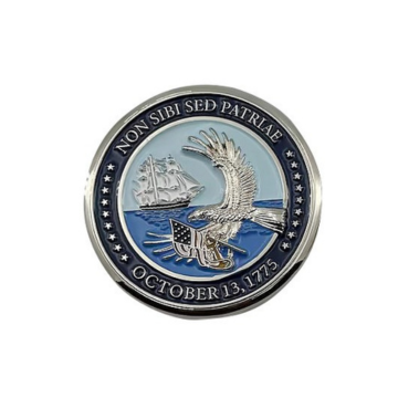
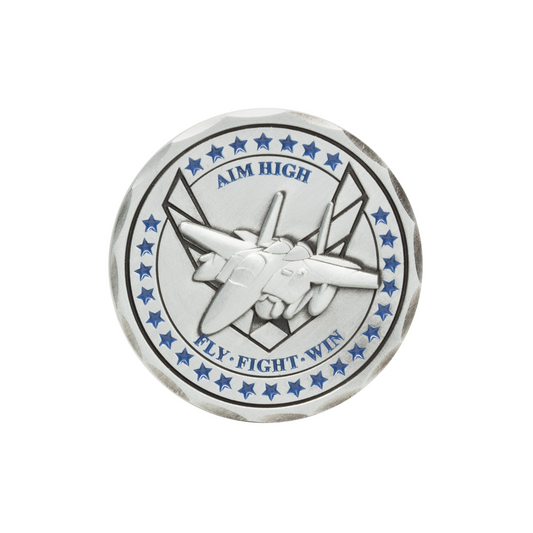
1. The official unit crest or shoulder sleeve insignia
The crest or patch is usually the fastest path to instant recognition. It also anchors the coin to an official identity that outlasts leadership changes. Clean placement matters, since the emblem needs breathing room to stay sharp after minting. Approval rules also apply, so you’ll want the correct version and colors.
2. A motto or battle cry in approved wording
A motto carries shared values without requiring extra explanation. Exact wording is important because small edits can change meaning and create avoidable disputes. Short mottos read better on metal and stay legible in low light. Pair the motto with the primary emblem, not with competing text blocks.
3. Mission symbols that match the unit’s specific role
Role-based symbols help a coin say what the unit does without adding a paragraph of text. They work best when the symbol is obvious to insiders and still understandable to outsiders. One strong icon usually beats several small ones. The role symbol should support the unit mark, not replace it.
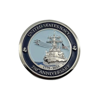
4. Deployment, activation, or exercise dates and locations
Dates and locations turn a general coin into a time-stamped record. That specificity makes the coin feel earned instead of generic. Formatting should stay consistent, since cluttered date strings are hard to read and easy to misprint. If space is tight, a single date range and a single location usually carry enough weight.
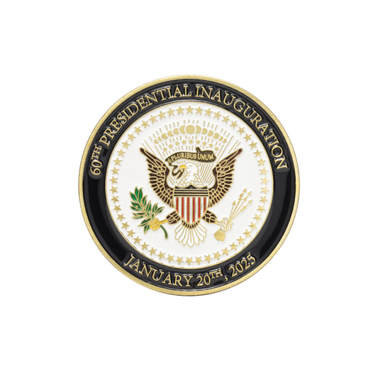
5. Command seals and leadership marks for presentation coins
Command seals signal authority and make a coin appropriate for formal recognition. They also tell the recipient the coin is tied to a specific office, not just a unit. Placement and scale matter because seals can dominate a design if they get too large. Keep the chain of command clear, with one primary seal and limited secondary marks.
6. Branch colors and heraldic rules members instantly recognize
Color choices do more than look good, they signal branch identity and tradition. Following heraldic conventions protects meaning and avoids accidental conflicts with official designs. High-contrast pairings will also improve readability as the coin wears over time. When rules and aesthetics align, the coin feels authentic without needing explanation.
7. Milestone text for awards, retirements, and key achievements
Milestone text gives a coin a clear “why now” that recipients can point to later. Dates of service, a role title, or a named achievement can carry serious emotional weight when it’s done with restraint. More than 16.2 million U.S. veterans were living in 2022, so long-term readability matters because these keepsakes often last decades. Keep milestone wording short, exact, and easy to verify.
8. Personal naming, call signs, or service number placement
Personalization shifts a coin from unit identity to individual recognition. It also raises privacy and dignity concerns, so placement and content need thought. Names and call signs read best on a clean field with strong contrast. If numbering is used, a consistent format helps with tracking and reorders.
9. Remembrance symbols approved by leadership and affected families
Memorial elements carry deep meaning, so they require extra care and clear consent. Symbol choice should be respectful, restrained, and consistent with unit practice. Avoid crowded imagery that can feel performative or unclear. A simple mark, paired with correct dates or initials, often communicates more than elaborate art.
10. Hidden details that reflect unit traditions and inside references
Subtle details reward close inspection and strengthen belonging. These work best as secondary elements that don’t block the main message. Keep them tasteful and avoid anything that would confuse or offend a wider audience. Hidden details should feel like a nod to tradition, not a puzzle.
11. Edge text, numbering, and texture that add identity
Edges are often overlooked, yet they’re prime space for clean information. Unit names, mottos, or serial numbers fit well on the rim without crowding the faces. Texture choices can also improve grip and add a “finished” feel. Edge work should stay simple so it stays readable after wear.
12. Shape and cutouts that echo equipment, patch, or badge
A custom shape can make a coin instantly recognizable even before someone sees the art. Cutouts and non-round shapes also introduce production constraints, so the design must stay structurally sound. Strong shapes feel intentional when they repeat a unit theme, not when they chase novelty. Keep the outline purposeful and make sure the coin still carries well.
|
Element |
Meaning checkpoint |
|---|---|
|
1. The official unit crest or shoulder sleeve insignia |
It anchors the coin to a recognizable, official unit identity. |
|
2. A motto or battle cry in approved wording |
It states shared values quickly when the wording stays exact. |
|
3. Mission symbols that match the unit’s specific role |
It communicates purpose without extra text or explanation. |
|
4. Deployment, activation, or exercise dates and locations |
It ties the coin to a specific moment that feels earned. |
|
5. Command seals and leadership marks for presentation coins |
It signals authority and clarifies who is formally recognizing service. |
|
6. Branch colors and heraldic rules members instantly recognize |
It protects tradition and keeps the design consistent with service norms. |
|
7. Milestone text for awards, retirements, and key achievements |
It makes the reason for recognition clear long after the ceremony. |
|
8. Personal naming, call signs, or service number placement |
It turns a unit coin into personal recognition when handled carefully. |
|
9. Remembrance symbols approved by leadership and affected families |
It honors loss with restraint and clear consent from stakeholders. |
|
10. Hidden details that reflect unit traditions and inside references |
It rewards members without distracting from the primary message. |
|
11. Edge text, numbering, and texture that add identity |
It adds traceable information while keeping the coin faces clean. |
|
12. Shape and cutouts that echo equipment, patch, or badge |
It creates instant recognition when the outline stays purposeful. |
How to prioritize elements for your unit coin design

Start with the one element that makes the coin unmistakably “yours,” then add one element that explains purpose, then add one element that marks time. That three-part stack will keep the design readable and defensible during review. Personalization and hidden details come last, after identity and intent are locked.
"If a detail doesn’t support the mission, it should not make the cut."
Practical constraints should shape your final picks, especially text length, contrast, and what can be produced cleanly at your chosen size. Official marks need correct artwork and proper placement, and memorial elements need extra approval discipline. Command Challenge Coins teams usually push for clear hierarchy and proof rounds that protect legibility, since a coin that can’t be read can’t carry meaning. The best coins feel inevitable, with every element earning its space.